RexMD Patient Portal Redesign
Role: Lead UI/UX designer
Timeline: 3 weeks
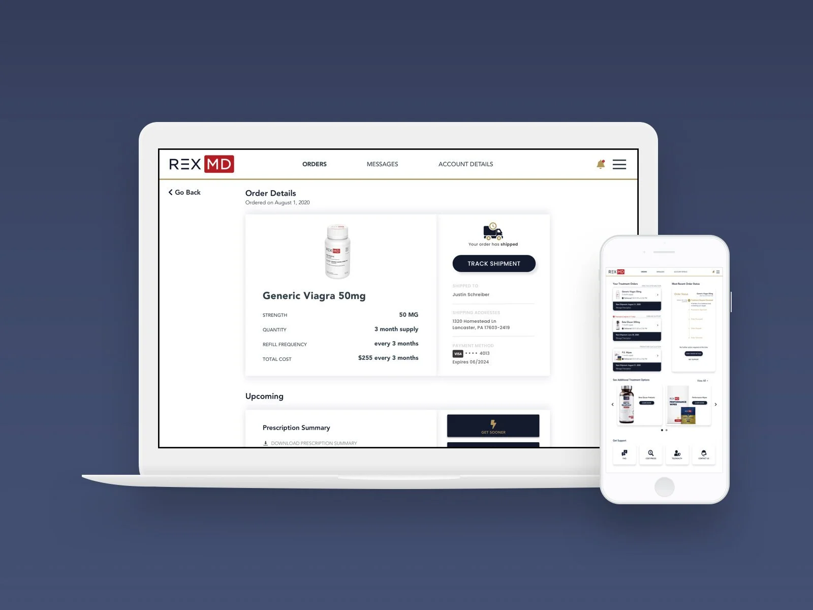
Background: RexMD is a male-oriented healthcare provider that specializes in E.D. treatment. I was tasked with redesigning RexMD’s patient portal where users could manage their accounts, subscription preferences, and all orders. The main goal for this redesign effort was to reduce the volume of customer-support tickets coming in from our users.
Initial exploration
In order to understand our user’s pain points, I dug through our customer-support chat archives to uncover any recurring themes and identified three major improvement opportunity areas:
Order status visibility
Required action item alerts
Subscription management flexibility'
I then listed out all of the must-have elements for patient portal dashboard:
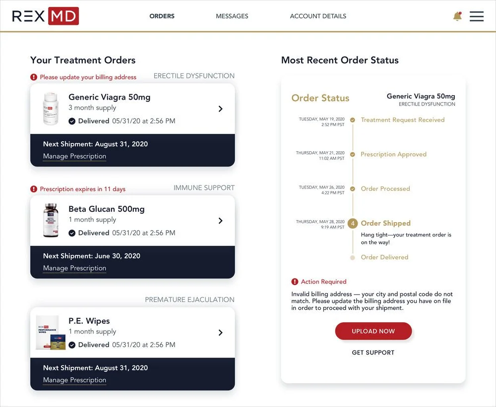
Order status for the user’s most recent purchase
Summaries of all the user’s active subscriptions
CTAs for any user actions needed to process an order
Notification center access
Additional products section
Support center access
The 3 pain points I needed to address were pretty straight forward, so my only goal was to design an interface that would thoughtfully and appropriately incorporate the solutions to these problems to the above elements from a contextual standpoint.
Design process
Pain Point 1 :Unclear order statuses
After users submitted their prescription requests, they had trouble identifying the status of their orders at any given time, and whether there were any additional steps they needed to complete. I quickly realized that a larger part of this problem was that users were unfamiliar with the overall prescription process, from start to finish.
To solve this problem, I designed a progress tracker so that users could understand each of the steps involved, and see which particular step their order was on.
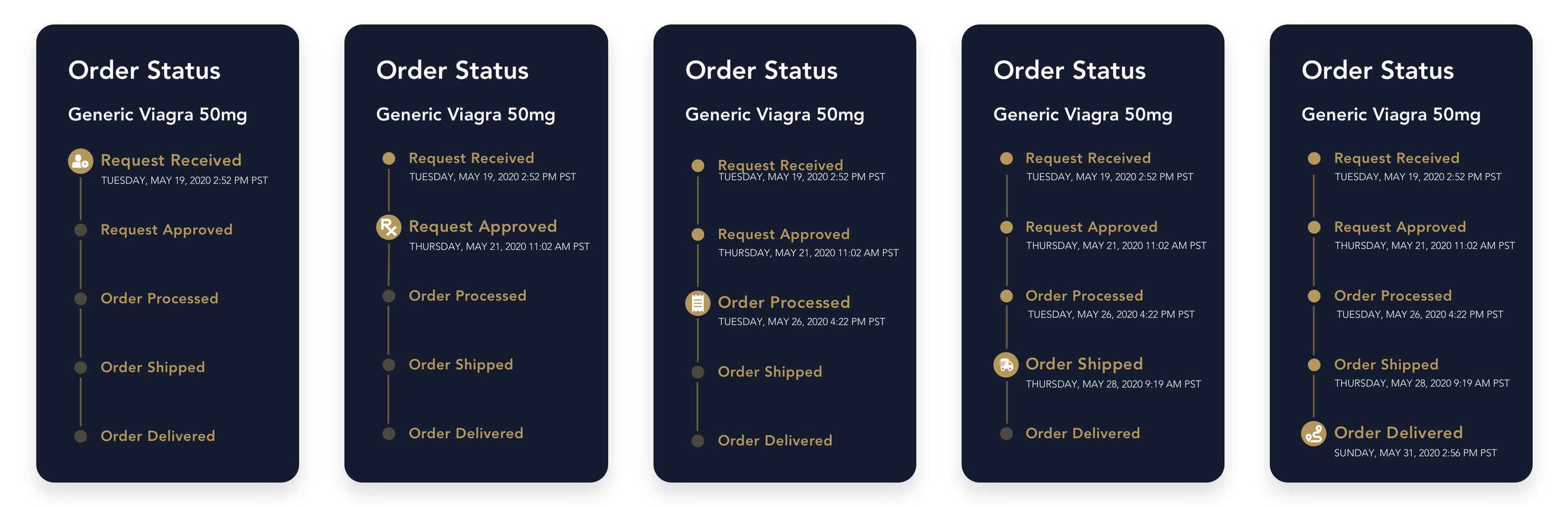
I laid out each step in sequential order and used icons to highlight the current status. After several hand-drawn sketches exploring both horizontal and vertical orientations, I opted for the latter as it not only optimized real estate but also offered more flexibility in adding additional elements such as the timestamps shown here. I included the timestamps so that users could make sure the process was moving along as expected, and also to offer a useful point of reference on timing for future deliveries.
Through multiple rounds of iterations, I arrived at my final order tracker design which included the following changes:
Product category displayed
RexMD wanted to introduce several new product categories including immune support and sanitary care to supplement their existing E.D. treatment line. I thought it might be helpful for the user to understand the distinctions between how each category processes an order—i.e., an order for an OTC immune support supplement would forgo the prescription request process users are familiar with for the E.D. line.
Supplemental text added
I added supplemental text under the stage currently in progress to color in the details of that particular step and prime the user on what to expect next.
Included buttons to view the order details and get support, while tweaking the color contrast
I switched to a white background to highlight important elements and build a clear hierarchy, making relevant information more readable and accessible.
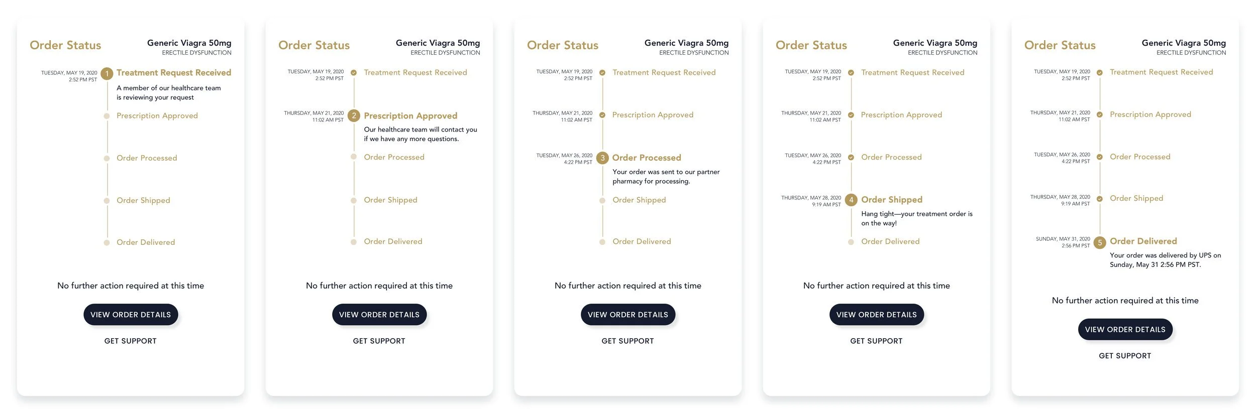
Pain Point 2 : Ambiguous calls-to-action
Prescriptions were often delayed because the users were unaware of a required action item they needed to complete in order to move the order beyond the process step it was stalled in.
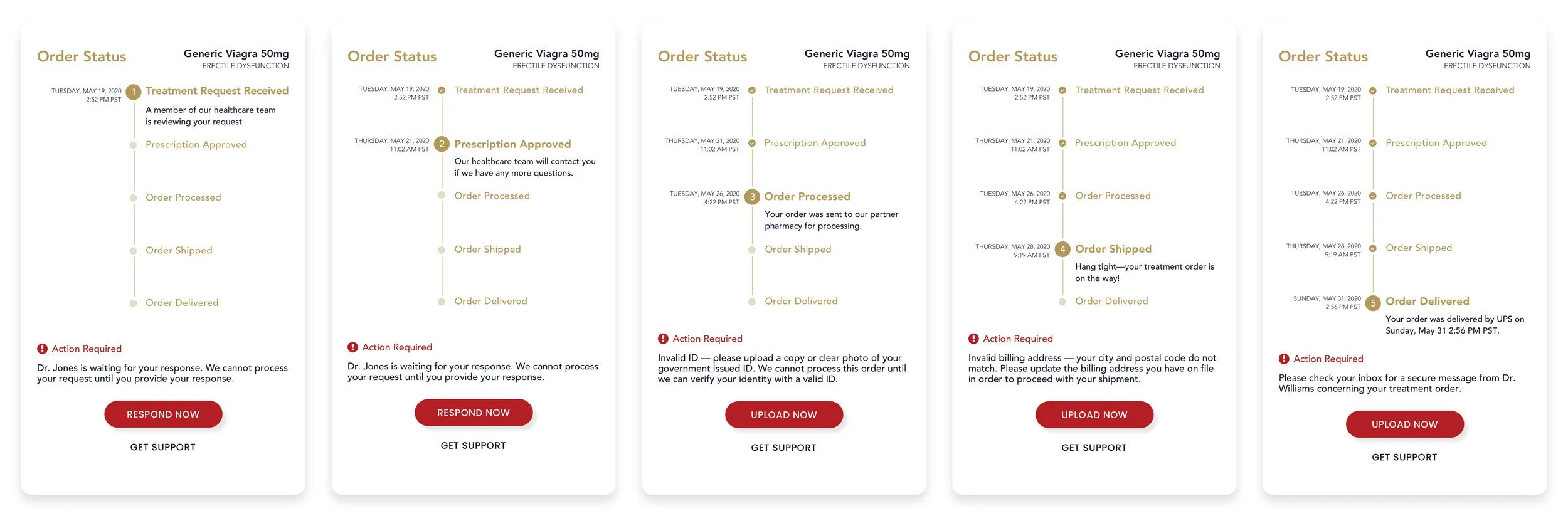
I created a secondary version of the status tracker that gets triggered for ‘Action Required’ states simply by highlighting the CTA in red.
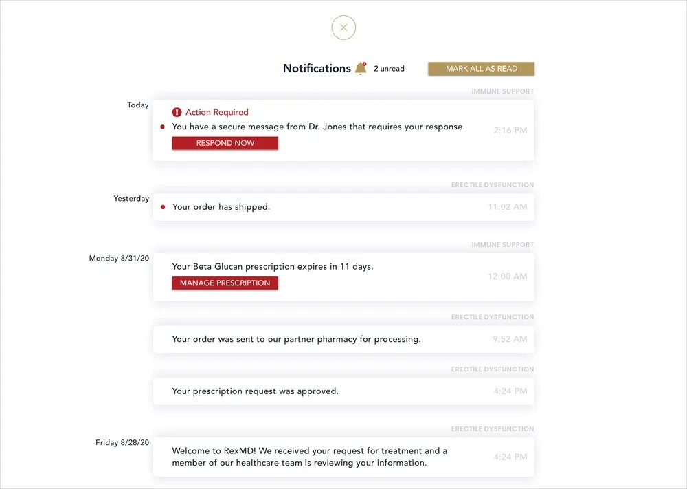
Throughout the general design system, I decided to minimize use of the color red—one of RexMD’s company colors—to reserve it for important alerts and CTAs as displayed below.
Pain Point 3 : Lack of subscription flexibility
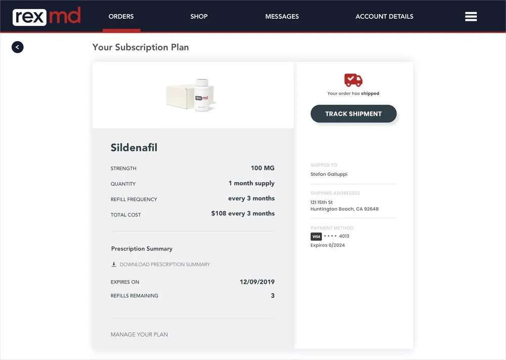
ORIGINAL DESIGN
Under the original design shown here, most subscription changes were being managed within the support center by RexMD’s customer service agents. Upon closer inspection, these support requests were for relatively simple changes such as delaying an order or switching to on-demand ordering.
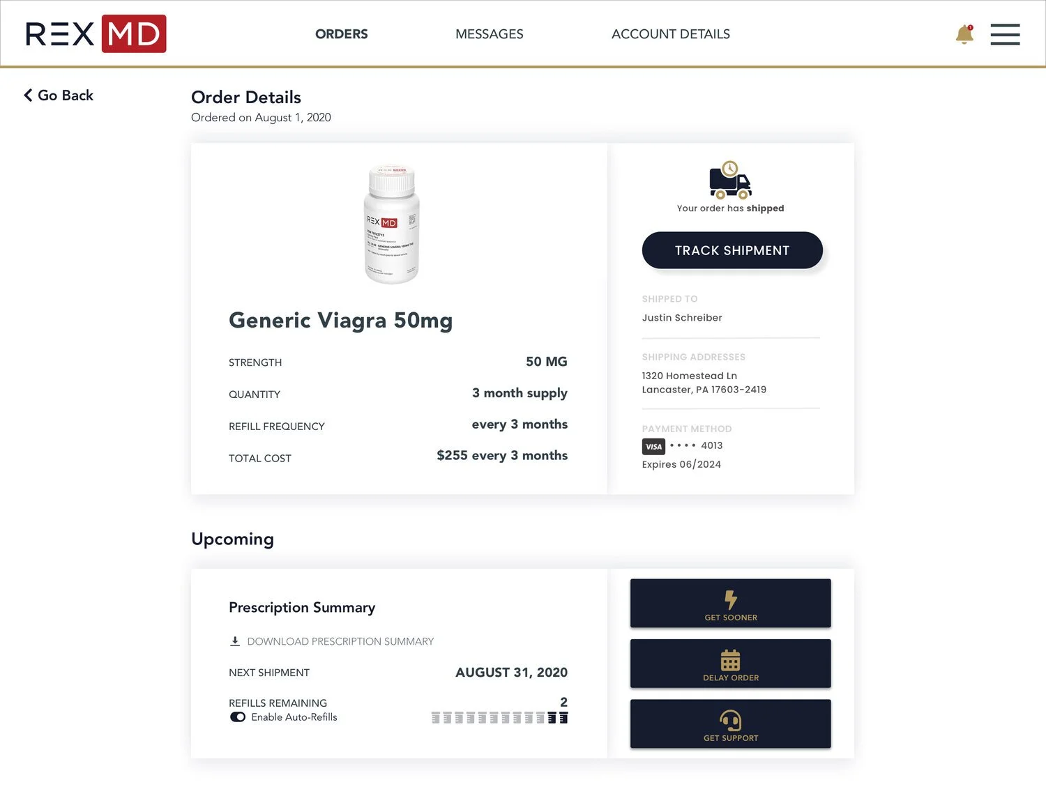
REDESIGNED
For the redesign, I divided the order details page into two visually distinct sections to help users distinguish between:
Information pertaining to their most recent order delivery
Details around their subscription plan in general, including upcoming deliveries
I changed the panel within the bottom section of the page to include three new buttons to help users quickly get support or to self-manage two of the most common change requests: expediting or delaying shipments.
The 3rd most common request was to switch from an auto-refilling subscription to on-demand ordering. I addressed this with a simple toggle under ‘Refills Remaining’ which opens a modal (shown below) to guide users through a quick deactivation process.
Conclusion
We observed a considerable reduction in the volume of new customer support tickets since the launch of this redesign. Delighted by these results, I’ve continued to work with the developer on exploring more design iterations that might cut this metric down even further.